The Curl Co
YEar
2025
Service
Packaging
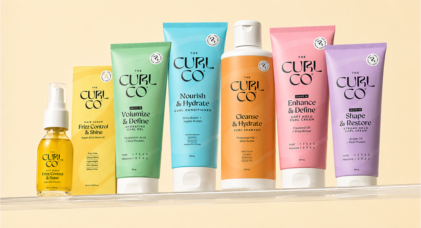
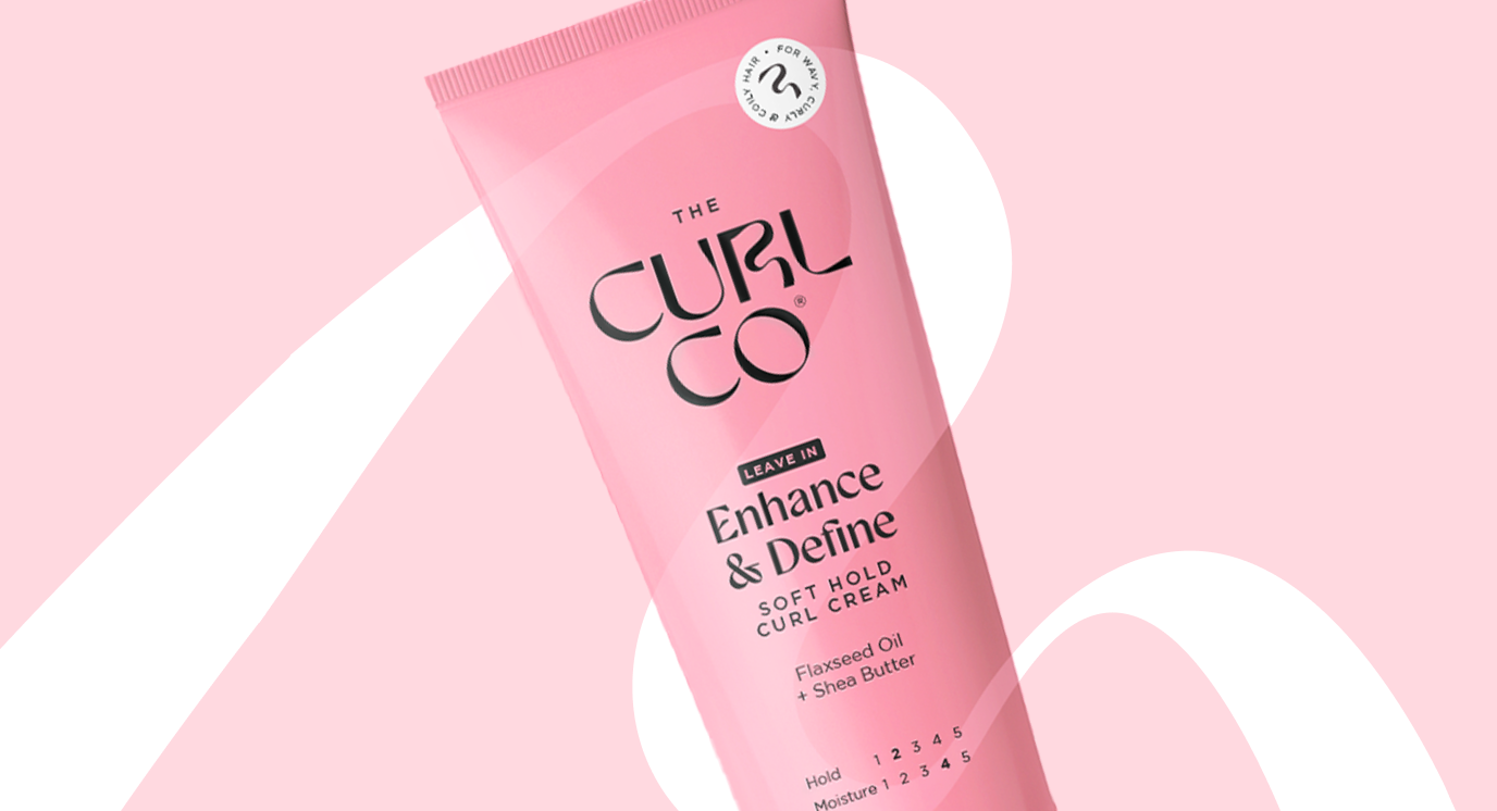
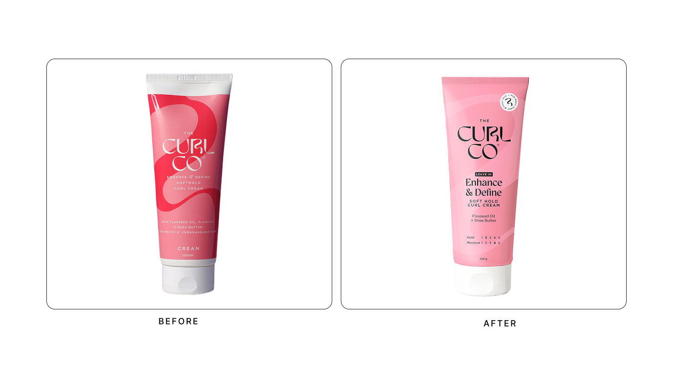
The Curl Co had a vibrant and recognisable packaging language. Its bold colours and signature curve gave the brand strong recall, but the same visual elements were also competing with the information consumers needed most. Product names, benefits, and key callouts were difficult to read at a glance, making it harder to distinguish between products. As the brand aimed to expand into new markets and competitive ecommerce landscapes, the brief wasn't to redesign the brand but to rethink its narrative for better recognition and communication.
THE WATCH EXPERIENCE
The Curl Co had a vibrant and recognisable packaging language. Its bold colours and signature curve gave the brand strong recall, but the same visual elements were also competing with the information consumers needed most. Product names, benefits, and key callouts were difficult to read at a glance, making it harder to distinguish between products. As the brand aimed to expand into new markets and competitive ecommerce landscapes, the brief wasn't to redesign the brand but to rethink its narrative for better recognition and communication.
Lorem ipsum dolor sit amet, consectetur adipiscing elit. Suspendisse varius enim in eros elementum tristique. Duis cursus, mi quis viverra ornare, eros dolor interdum nulla, ut commodo diam libero vitae erat. Aenean faucibus nibh et justo cursus id rutrum lorem imperdiet. Nunc ut sem vitae risus tristique posuere.
Lorem ipsum dolor sit amet, consectetur adipiscing elit. Suspendisse varius enim in eros elementum tristique. Duis cursus, mi quis viverra ornare, eros dolor interdum nulla, ut commodo diam libero vitae erat. Aenean faucibus nibh et justo cursus id rutrum lorem imperdiet. Nunc ut sem vitae risus tristique posuere.
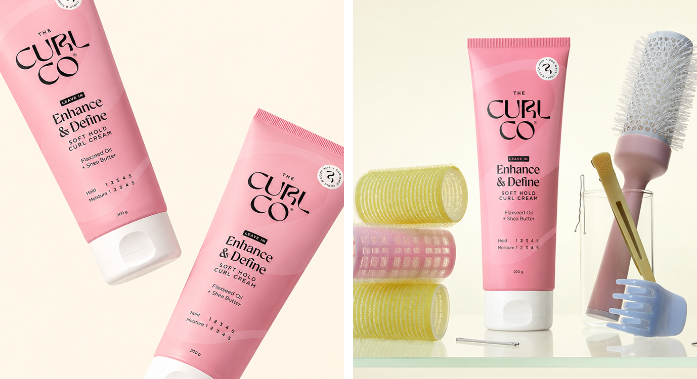
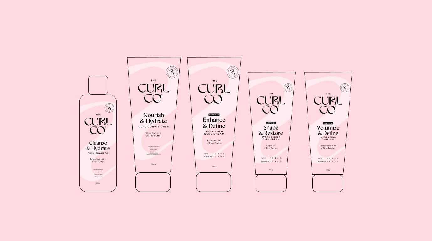
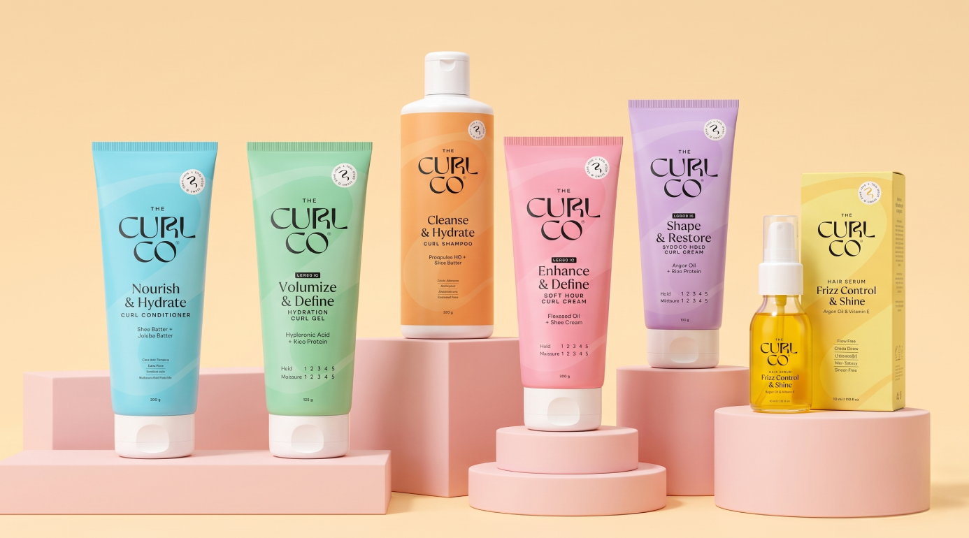
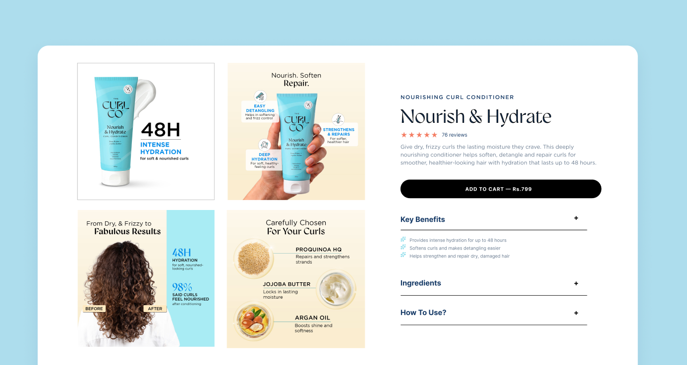
The opportunity was clear: retain the brand's recognisable language while increasing clarity of information and enabling larger product expansions. Our approach was built around clarity. Redesigning for packaging visibility while establishing the brand's value proposition, thereby driving stronger e-commerce performance. The result is a packaging system in which every element has a clear role: colour builds recognition, the curve retains brand memory, and typography delivers product clarity.



Next Project

Strategy

@studiotaketwo
Branding
@studiotaketwo
Packaging
@studiotaketwo
Let’s start
creating together.

