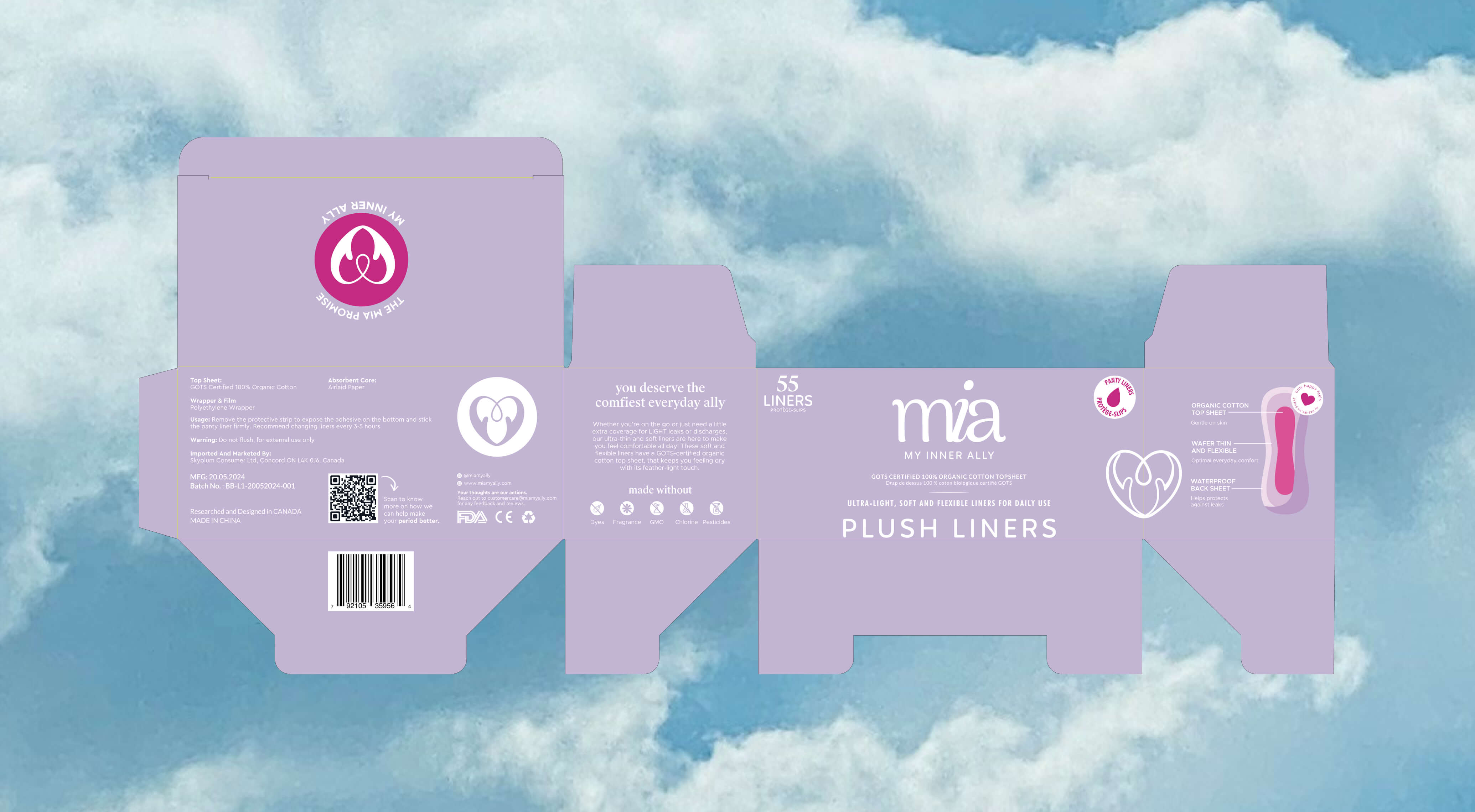
Mia, My Inner Ally

YEar
2024
Service
Branding & Packaging
Credits
Design : Urvi Shah Design. Photography credits : Papsicle Studio
Mia entered a menstrual care market dominated by legacy brands whose visual language was crowded and designs that reinforced shame rather than pride. The challenge extended beyond product differentiation. Mia needed to disrupt entrenched purchasing behaviors in a category where brand loyalty runs deep, switching costs feel high, and shelf presence is cluttered with similar-looking competitors. Our mandate was to create a visual identity that would justify a price premium over conventional options while remaining accessible enough to convert first-time organic buyers.
THE WATCH EXPERIENCE
Mia entered a menstrual care market dominated by legacy brands whose visual language was crowded and designs that reinforced shame rather than pride. The challenge extended beyond product differentiation. Mia needed to disrupt entrenched purchasing behaviors in a category where brand loyalty runs deep, switching costs feel high, and shelf presence is cluttered with similar-looking competitors. Our mandate was to create a visual identity that would justify a price premium over conventional options while remaining accessible enough to convert first-time organic buyers.
Lorem ipsum dolor sit amet, consectetur adipiscing elit. Suspendisse varius enim in eros elementum tristique. Duis cursus, mi quis viverra ornare, eros dolor interdum nulla, ut commodo diam libero vitae erat. Aenean faucibus nibh et justo cursus id rutrum lorem imperdiet. Nunc ut sem vitae risus tristique posuere.
Lorem ipsum dolor sit amet, consectetur adipiscing elit. Suspendisse varius enim in eros elementum tristique. Duis cursus, mi quis viverra ornare, eros dolor interdum nulla, ut commodo diam libero vitae erat. Aenean faucibus nibh et justo cursus id rutrum lorem imperdiet. Nunc ut sem vitae risus tristique posuere.

We developed a design system anchored in restraint and clarity. The clean, neutral aesthetic serves multiple strategic purposes. First, it positions Mia within the broader clean living movement rather than confining it to traditional menstrual care conventions. By adopting design principles associated with premium wellness brands like generous white space, refined typography, minimal compositional elements, we aimed to elevate the perceived value and justify the product's premium pricing. The neutral palette of lilac, peach, and strategic pink accents was deliberately chosen to feel fresh. Lilac conveys calm and care without clinical coldness; peach introduces warmth and approachability; the accent pink provides just enough category recognition.


Next Project
Strategy

@studiotaketwo
Branding
@studiotaketwo
Packaging
@studiotaketwo